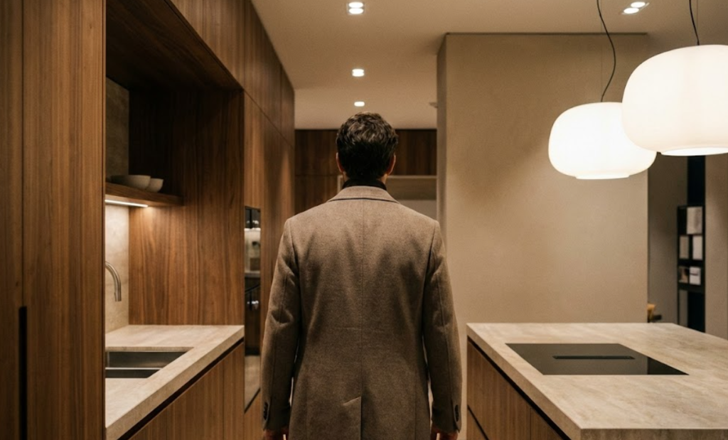

# Neuroarchitecture and wellbeing: design so the client feels safe
In high-ticket contexts, people don’t delay because of “price”. They delay because they sense risk.
I don’t use “wellbeing” as a trendy word. I treat it as a commercial variable.
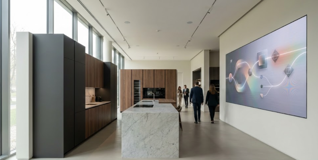
When someone steps into your showroom (or experiences you through a meeting, a site visit, or visuals), their nervous system makes a silent calculation: does this place take care of me, or does it demand something from me? In premium, “demand” is often interpreted as risk.
For me, neuroarchitecture isn’t pop psychology. It’s practical: how space shapes attention, calm, trust, and control. If the space triggers alertness, the buyer protects themselves: they ask more defensive questions, compare more, and postpone. If the space triggers safety, the buyer opens up: they listen, imagine, and decide.
This is not a lighting handbook. No measurements. No step-by-step. What I’m sharing is how I diagnose whether your experience reduces uncertainty—or creates it.
## Wellbeing is not “comfort”. It’s uncertainty reduction
High-ticket buying has layers:
-
- aesthetics (what looks good)
-
- function (what can be justified)
-
- and safety (what makes the decision possible).
Safety shows up as:
-
- control (I understand what’s happening)
-
- predictability (fewer surprises)
-
- respect (I don’t need to defend myself).
Wellbeing is the infrastructure behind that.
## The base emotion: “I’m safe here”
Some showrooms look perfect yet feel tense.
I notice it when people:
-
- lower their voice
-
- move carefully
-
- scan the room more than the proposal
-
- sit down like they’re about to be evaluated.
That’s not a buyer problem. That’s context design.
## The levers that influence trust first
I group wellbeing into three levers that are felt before they’re explained:
### Light: clarity without aggression
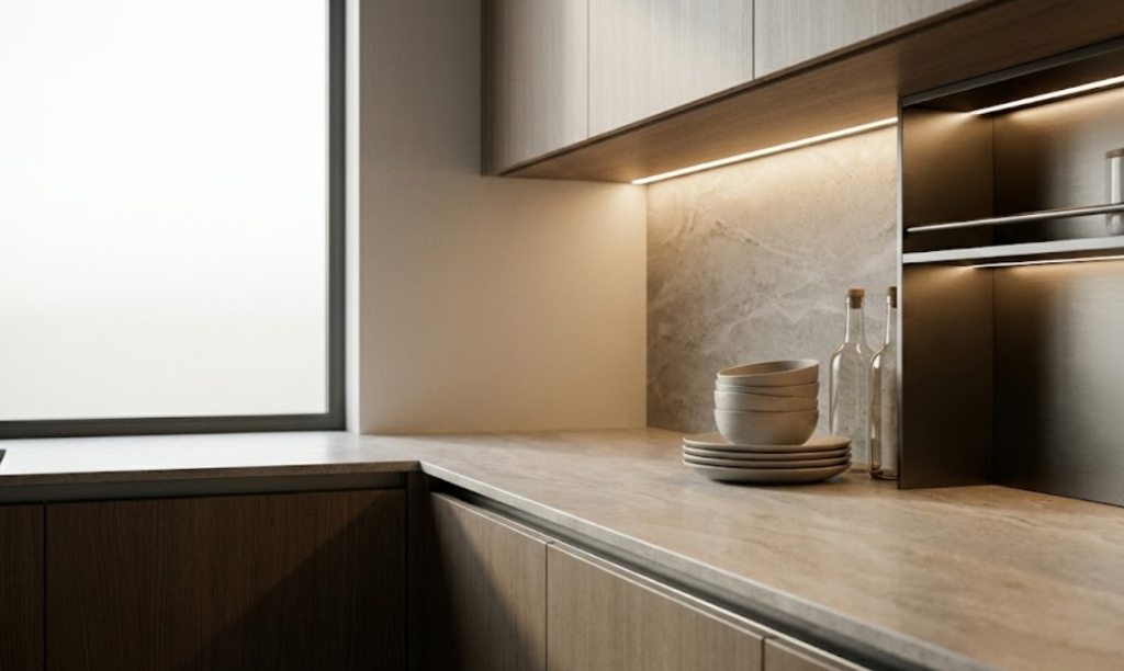
Light can communicate precision—or threat.
Alert signals:
-
- harsh contrast and dirty shadows
-
- glare that makes you squint
-
- overly dark zones where materials disappear
-
- theatrical scenes that feel like they’re hiding something.
Premium doesn’t need darkness to feel premium. It needs coherence: light that helps the buyer read materials, volumes, and real use without fatigue.
What I want is not “more light”. I want governed light—light with intention.
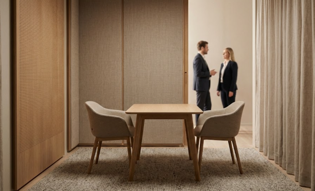
### Acoustics: calm and privacy
Acoustics decide whether a conversation becomes intimate—or defensive.
If buyers feel others can hear them, they censor themselves. And once they censor themselves, you lose the real information: fears, constraints, priorities.
Risk signals:
-
- echo that forces louder voices
-
- background noise that interrupts
-
- overlapping conversations
-
- no “decision bubble” where sensitive topics feel safe.
In premium, privacy is not luxury. It’s conversion.
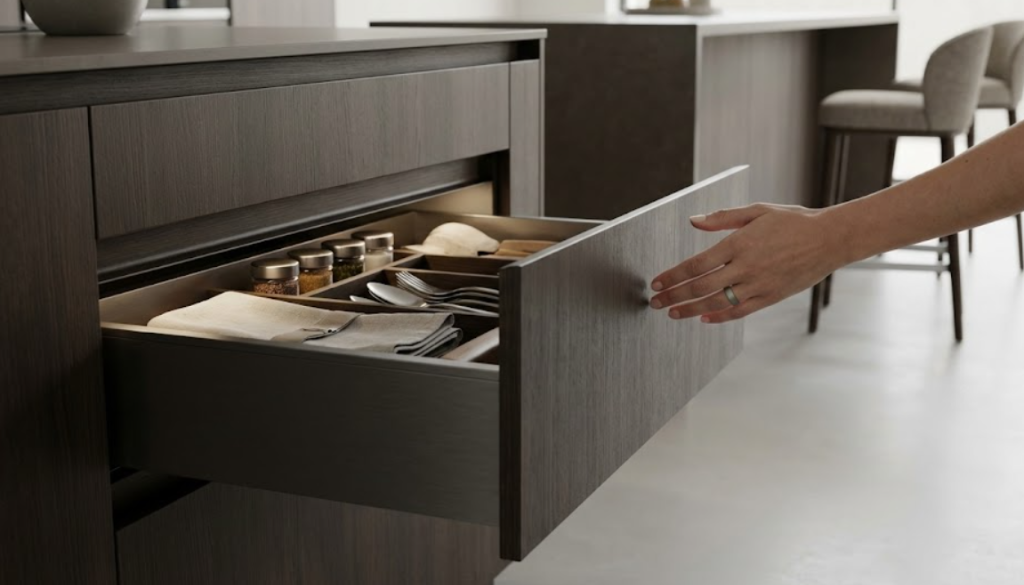
### Ergonomics: the body is the judge
The body decides before the mind.
When ergonomics fail, buyers don’t always articulate it. They just register friction:
-
- “I can’t imagine living with this,”
-
- “it feels uncomfortable,”
-
- “something doesn’t click.”
Signals:
-
- circulation that feels like asking permission
-
- gestures that feel awkward
-
- openings that invade
-
- layouts that make the space feel tighter than it is.
In premium, ergonomics is the silent proof that the product is designed to last.
## The common mistake: designing for photos, not for a nervous system
Photo-first design aims for instant impact. Wellbeing design aims for sustained trust.
Instant impact can grab attention. But if it triggers alertness, it harms closing.
Typical risks:
-
- extreme contrasts that exhaust
-
- “loud” materials that don’t rest
-
- cold atmospheres
-
- intimidation instead of guidance.
I’m not against bold design. I’m against bold design without emotional control.
## Real trade-offs you must decide
These are not taste debates. They’re strategic decisions:
-
- drama vs clarity
-
- minimalism vs comfort
-
- openness vs privacy
-
- brand coherence vs commercial flexibility
Mature businesses decide these consciously. Immature businesses leave them to chance.
## How I know wellbeing is a competitive edge
I look at operational signals, not opinions:
-
- Do people stay longer without fatigue?
-
- Do meetings progress, or stall?
-
- Are objections technical—or “vague doubt”?
-
- Does the team push, or guide?
-
- Do buyers touch, ask, explore—or freeze?
When wellbeing is right, the buyer shifts from defense mode to project mode.
## Wellbeing as a system, not a designer’s talent
Leadership-level point: if wellbeing depends on one person’s taste, it’s fragile. If it’s governed as a criterion, it scales.
Not bureaucracy—just coherence rules:
-
- what feelings we want to trigger
-
- what signals we remind ourselves to avoid
-
- what commitments we accept to sustain it.
## Diagnostic questions I use
-
- Does your space invite questions or silence?
-
- Does the buyer feel observed or supported?
-
- Does light help decisions or skepticism?
-
- Can you talk about doubts and money without tension?
-
- Does your premium feel like care or coldness?
-
- Does your team use the space—or fight it?
## Closing
I design the experience so the buyer feels safe, because safety accelerates decisions without pressure. Light, acoustics, and ergonomics are not decoration: they’re a premium advantage.